


One of the most common concepts in frontend development has to be CSS grids and flexbox. There are literally a million and one articles and resources on the internet that teach about CSS flexbox and grid.
Hello 💟, welcome back to my blog. When I thought of writing about this topic, I was discouraged😕 by the number of available resources that are already out there but someone once told me that every writer has their own unique voice, so this is me putting out my voice for every reader that can identify with it😐.
What are CSS Grid and Flexbox and why do we need them?
Building a website page is like arranging a room, with so many items to find spaces for, the room wouldn’t look good if we kept dumping stuff anywhere. I personally think it is positioning and arranging that makes a room looks good. Just like a room, a webpage has various elements and containers that need to be appropriately positioned to avoid bombarding. Now, that is the point where CSS grid and flexbox come in. CSS Grid and flexbox are layout modules that let us design complex layouts for positioning and arrangement.
What are their similarities and differences?
Both of these concepts are widely utilized, as a matter of fact, some developers even have favorite preferences between the two. Flexbox and CSS Grid share numerous similarities and either of them can be used in different scenarios. The major similarity is that they are both layout models for positioning.
As much as I do not have a personal preference, I also have to admit that they have differences that dictate their use for me. The principal difference between CSS Grid and flexbox is that flexbox works mainly for one-dimensional positioning that is, it was designed to either arrange elements in a row or in a column. Grid, on the other hand, was created for two-dimensional positioning, that is, it was designed to arrange elements in both rows and columns at the same time. Like I said earlier, this difference doesn’t make one better than the other, it instead gives us the luxury of choosing which is best for whatever scenario we’d like to apply them to. Another big win is that they can be used together, you just have to understand when to use either of them and when to combine them both.
CSS flexbox
Personally, I got used to using flexbox first so I’m going to start with the basics of flexbox. This is going to be quite practical so here are items contained in a parent container that we intend to position using flexbox.
<div class="fruit-container">
        <div class=" fruit banana">
            BANANA
        </div>
        <div class="fruit orange">
            ORANGE
        </div>
        <div class="fruit strawberry">
            STRAWBERRY
        </div>
        <div class="fruit watermelon">
            WATERMELON
        </div>
        <div class="fruit apple">
            APPLE
        </div>
    </div>
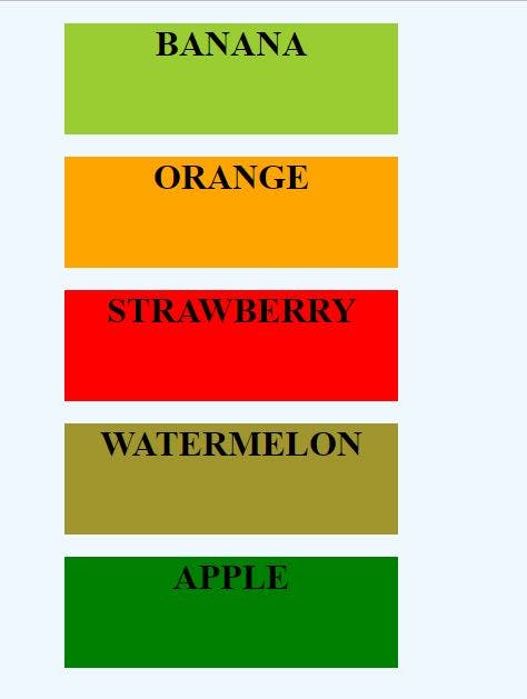
To define a flexbox, we set the display property of the parent container to flex. By default, the flex direction is set to row.
.fruit-container {
  display: flex;

}

As I said earlier, flexbox works mainly for one-dimensional positioning, so the flex items are either arranged in horizontal rows or vertical columns. Due to this criterion, it is necessary that we define the direction of our flex. We can set any of these four different values to our flex-direction:
- row: left to right
- row-reverse: the right to left
- column: top to bottom
- column-reverse: bottom to top
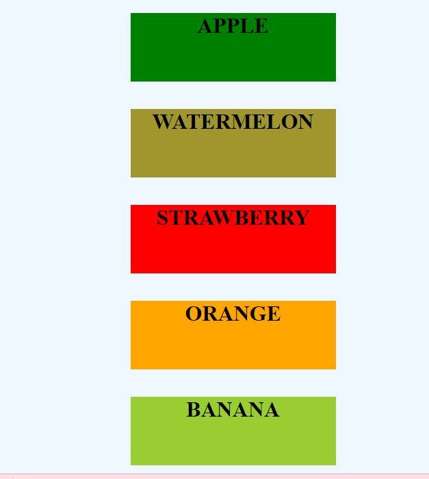
.fruit-container {
  display: flex;
   flex-direction: column-reverse;
}
 Lastly, we can use the align-item and justify-content properties to align, justify and distribute space between our flexbox items.
CSS Grid
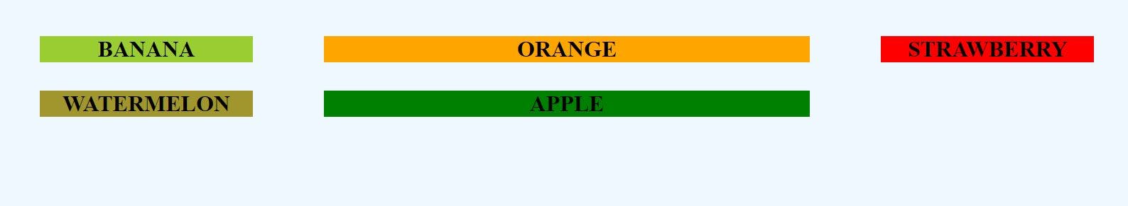
Grid items are also placed in rows by default but unlike flexbox, the items can be arranged in two dimensions. With grid, we can define the size of each cell area
.fruit-container {
  display: grid;
  grid-template-rows: 30% auto;
  grid-template-columns: 400px auto 400px
}
 Also, we can give the tracks gap by using the grid-gap property and also repeat our tracks by using the repeat() notation. Also, we can also use the grid-area property to specify a grid item's size and location in a grid arrangement
Arranging elements and items on our website is of utmost importance and that is why it is super essential to understand the basics of CSS Grid and Flexbox and utilize them for this objective. I don't have a favorite between the two, kindly let me know if you have a favorite and also give me reasons for that in the comment section. Thank you!😊